Pecary E -Learning Website & App Case Study


Project overview
The Product
Pecary online course is a Nigerian based online teaching service designed to connect individuals who are looking to learn a new skill or improve on existing ones with a team of experienced professionals and tutors.
Project duration
March 2022 to April 2022
The Problem
Many persons would love to take extra courses but they face 2 major issues; the absence of qualified tutors and the lack of self scheduled training classes
The Goal
Create an app that would bridge the gap between the professionals and the eager students as well as make it possible for even those with full time jobs to learn at their convenience
My Role
Lead UX designer for the app and responsive website from start to finish
Responsibilities
-
Conducting interviews,
-
paper and digital wireframing,
-
low and high-fidelity prototyping,
-
conducting usability studies,
-
accounting for accessibility,
-
iterating on designs,
-
determining information architecture, and
-
responsive design.
Understanding
The User
-
User research
-
Personas
-
Competitive audit
-
Ideation
User Research Summary
I conducted various interviews to find out what stops many persons from taking courses they are interested in. I found out that most persons actually prefer to learn from an indigene of their country rather than foreigners.The feedback also made it clear that many persons dont apply for physical classes because they have to be at work or somewhere else
User Personas


Competitive Audit
Introduction
The purpose of this competitive audit report is to evaluate the user experience (UX) of other online learning apps. The competitors selected for this analysis are Coursera, Udemy, and Skillshare. The report will cover various aspects of the UX, such as the homepage, course search, course page and payment process.
Methodology
The audit was conducted by creating an account on each platform, browsing through the course offerings, and taking note of the overall UX. The evaluation criteria were based on ease of use, visual design, information architecture, and consistency. The feedback was recorded and analyzed to provide a comprehensive overview of the strengths and weaknesses of each platform.
UI/UX
Coursera
Udemy
Skillshare
Homepage
Cluttered homepage with too much information competing for the user's attention. The CTA button was visible but didn't stand out enough
Simple and clean homepage but lacks clear navigation to courses
Inviting and visually pleasing homepage with a clear value proposition, but the CTA button was difficult to find.
Course Page
Well-designed course page with comprehensive information on the course, the instructor, and the curriculum.
User-friendly course page with a clear and concise interface, but the design lacked visual appeal
Aesthetically pleasing course page with comprehensive information, but the design was cluttered.
Course Search
Coursera had a powerful course search with detailed filters, but the interface was jampacked, making it overwhelming for users.
Straightforward course search with a clear and concise interface,
Adequate course search with intuitive filters
Payment Process
A secure payment process with various payment options. Clear directions on how to pay
Simple payment process, but the payment options were limited
Clear payment process, with order confirmation before payment
Ideation
I came up with ideas on how to make the app easy to access and make sure users don't feel intimidated by its appearance. This was a weakness I noticed in my competitors.
Starting The Design
-
Digital wireframes
-
Usability studies
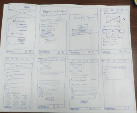
Digital Wireframes
After ideating and creating paper wireframes, I created the initial designs for the online course app.

Usability Study: Parameters

Usability Study : Findings
1
Payment
Users want to review order before paying
2
Schedule
Users want to be able to schedule courses for later
Refining The Design
-
Mockups
-
Accessibility
-
Responsive Design
Mockups
1
Based on feedback gotten from the usability study, I added an extra page for payment review so that users can confirm their order before final payment
Before usability study
After usability study


2
I also added a payment schedule button so that users can easily set a preferred date for study
Before usability study

After usability study
.png)
Mockups

.png)
.png)


Accessibility Considerations
1
Icons are labelled for easy read by a screen reader
2
Colour choice meets WCAG specifications
Responsive Designs
I designed for mobile, tablet and desktop screen. I optimized the designs to fit specific user needs of each device and screen size
Mobile
.png)
Tablet

Desktop

Going Forward
-
Takeaways
-
Challenges
Takeaways
Impact
Users actually loved the idea of having an indigenous online course app, with teachers they could easily identify with. Others liked the fact that they could learn at their own convenience.
What I learned
I have learned never to underestimate the power of user testing and searching for feedback. I always think the design is okay, but after each usability study, I see valid points from my participants that need to be taken into consideration.
Challenges
-
One of the first challenges I faced was to ensure the design wasn't looking too clustered. This kind of design really had a lot of information to present for various courses in various fields.
-
Another challenge was designing for different screen sizes like desktop, tablet and then mobile screens. For each design i'd have to rearrange the placements of texts, boxes, font sizes etc
Let's Connect